IRCTC-Redesign
A UX redesign of the IRCTC ticket booking experience focused on reducing friction and simplifying complex user flows.
00

problem
Booking tickets on IRCTC often feels confusing and overwhelming. Too much information appears at once, key actions aren’t clearly highlighted, and the flow takes users through multiple cluttered steps. For many users, especially first-timers, the process feels stressful and hard to navigate.
solution
The redesign simplifies the entire booking journey. The flow was restructured to feel step-by-step and easy to follow. Important actions are clearer, screens are cleaner, and information is grouped logically. The goal was to reduce confusion and make booking a ticket feel straightforward and stress-free.
IRCTC Redesign started from a very relatable frustration — booking a train ticket shouldn’t feel stressful. Almost everyone in India has used IRCTC at some point, and most people share the same experience: too many steps, cluttered screens, and constant second-guessing if you’re doing things correctly.
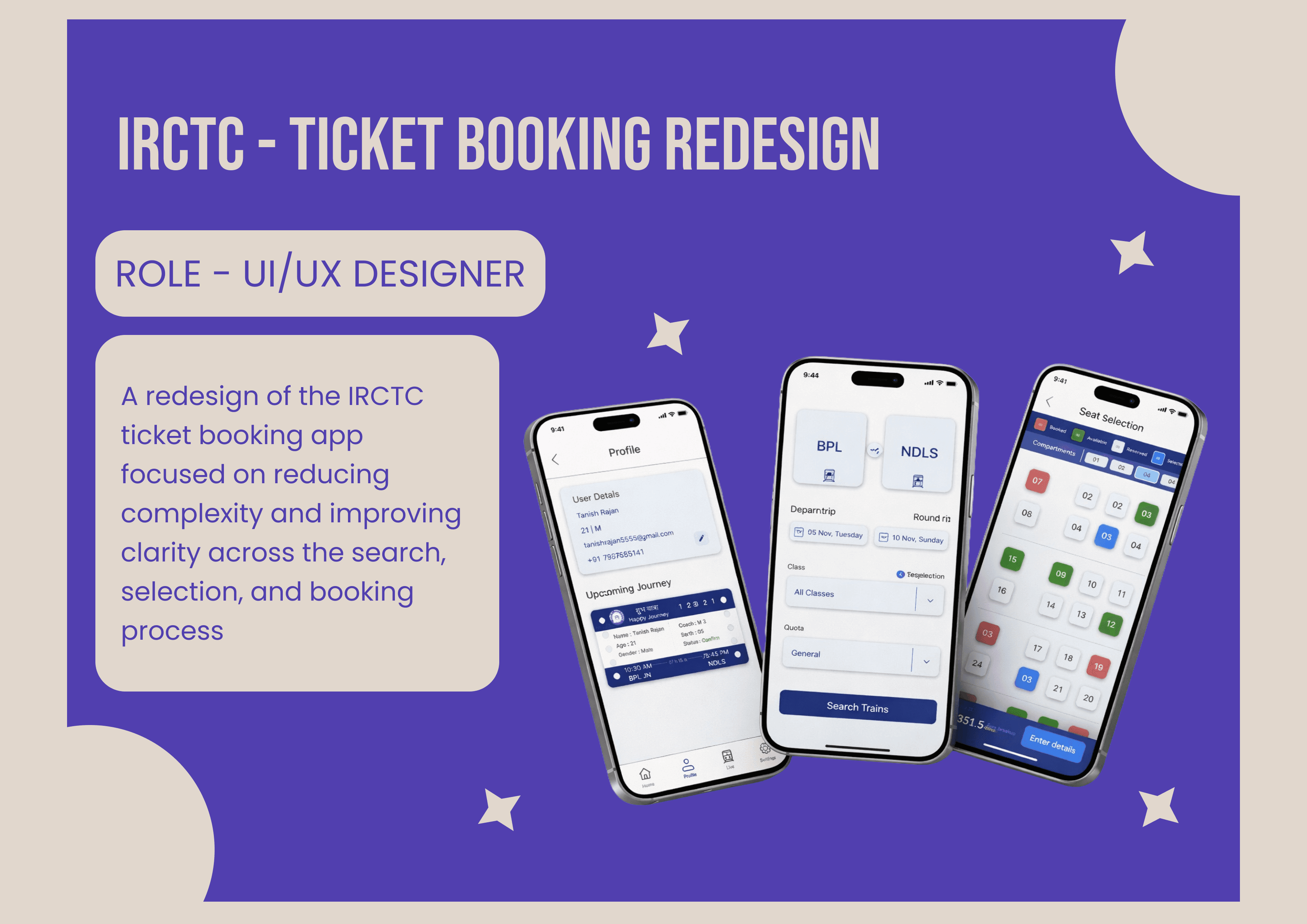
While exploring the existing platform, it became clear that the issue wasn’t functionality — everything was technically there. The real problem was clarity. Important actions were buried under dense information, and the flow didn’t guide users confidently from one step to the next.
The redesign focused on simplifying the journey without changing the core system. Screens were decluttered, information was grouped logically, and primary actions were made more visible. The goal was to make the booking process feel structured and predictable instead of overwhelming.
This project was less about making it “modern” and more about making it usable. The final outcome is a cleaner, calmer booking experience that helps users move from search to confirmation with more confidence and less friction.
year
2025
timeframe
25 days
tools
Figma
category
UI/UX
01

02

03

04


